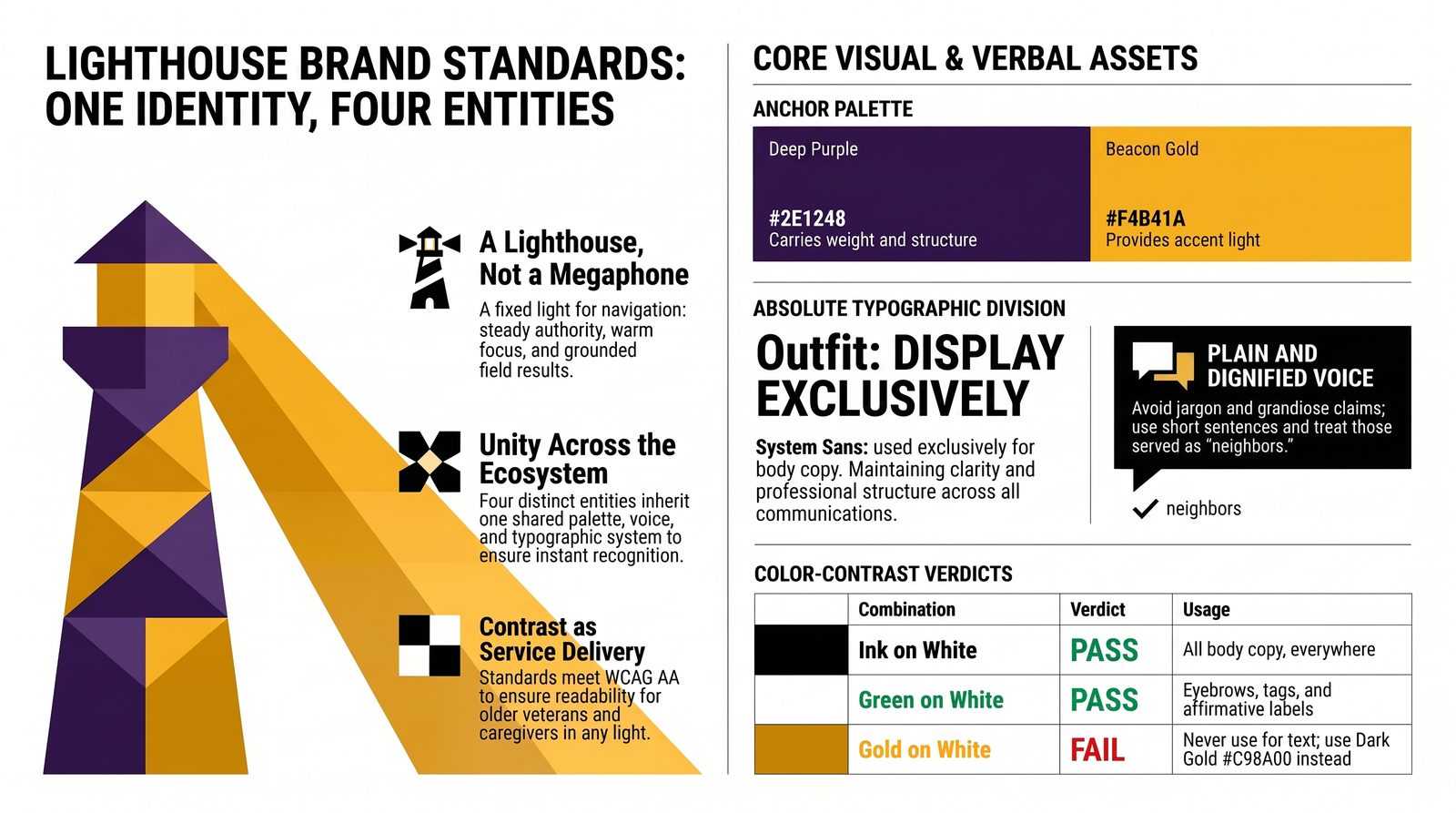
The rules that keep four entities looking like one family
The ecosystem speaks through four organizations, several websites, a document library, decks, signage, and a mobile outreach unit. Without a written standard, each surface drifts — and drift reads as disorganization to exactly the funders and partners we most need to convince.
This anchor fixes the identity in writing: the palette with exact values, the typefaces and how to size them, how the logo may and may not be used, the voice we write in, and how the four entity brands relate to the parent.
The test of a brand standard is simple. Someone who has never met us should be able to build a compliant page from this document alone.
A lighthouse, not a megaphone
Everything in the system serves one idea: a fixed light that others navigate by. Steady, not loud. Present in the dark, not performing in daylight. That idea sets the tone for color, type, and language alike.
The palette
Nine values, no substitutes. Every color below carries a defined job; using a color outside its job is what makes materials look off-brand even when the hex codes are right.
Brand colors
Neutrals & surfaces
2. Purple leads, green confirms. Purple for structure and headings; green reserved for what is verified, ready, or affirmative.
3. No invented colors. If a need is not covered here, it is a gap in the system to be decided — not improvised in the moment.
Contrast rules that keep us readable
Our audience includes older veterans, caregivers reading on phones in poor light, and reviewers scanning printed packets. Contrast is not decoration — it is service delivery.
| Combination | Verdict | Where to use it |
|---|---|---|
| Ink on white | Pass | All body copy, everywhere |
| Mid purple on white | Pass | Links, headings, emphasis |
| Green on white | Pass | Eyebrows, tags, affirmative labels |
| Gold on deep purple | Pass | Hero eyebrows, accents on dark bands |
| Beacon gold on white | Fail | Never for text — use dark gold #C98A00 instead |
| Bright purple on white | Caution | Large text and hover states only |
Two typefaces, clearly divided
Outfit carries every display moment — headings, labels, numbers, buttons. A system sans carries everything meant to be read at length. The division is absolute: never set body copy in Outfit, never set a heading in the body face.
| Role | Face | Size | Notes |
|---|---|---|---|
| Page title (H1) | Outfit 800 | 33px | Reverses to white on the purple hero band |
| Section (H2) | Outfit 700 | 22px | Deep purple, tight tracking |
| Subsection (H3) | Outfit 700 | 16px | Deep purple |
| Eyebrow | Outfit 700 | 11.5px | Uppercase, wide tracking, field green |
| Body | System sans | 15px / 1.6 | Ink on white; never below 13px in print |
| Caption / meta | System sans | 11.5–12.5px | Muted gray |
How the mark may be used
- Keep clear space around the mark equal to the height of its shortest side
- Place it on white, on the wash, or on deep purple — nothing else
- Reproduce it at 30px minimum on screen, 0.4in minimum in print
- Pair it with the full organization name on first use in any document
- Use the horizontal lockup in headers; the standalone mark only where the name appears nearby
- Recolor it, add gradients, shadows, outlines, or effects
- Stretch, rotate, skew, or crop it
- Set it on a photograph without a solid backing shape
- Rebuild it in another typeface or redraw it by hand
- Place it beside a partner logo without equal clear space and equal visual weight
How four entities relate to one identity
The consortium is the parent. Each arm keeps its own name and mandate but inherits the palette, the type, and the voice — so a funder meeting one entity recognizes the others instantly.
How we sound
The voice is constant; the tone shifts with the room. To a veteran we are plain and warm. To a funder we are precise and evidenced. To a board we are candid about what is not yet true.
- Plain. Short sentences. Ordinary words. Acronyms explained on first use.
- Specific. Named places, named projects, real numbers — or an honest “not yet measured.”
- Dignified. People we serve are neighbors and veterans, never cases or beneficiaries.
- Accountable. We say what we have not done as readily as what we have.
- Grandiose. No “revolutionary,” “world-class,” or “unprecedented.”
- Pitying. No language that frames veterans as broken or helpless.
- Vague. No “serving many” where a number belongs.
- Jargon-heavy. No stacking acronyms where plain nouns would do.
| Instead of this | Write this |
|---|---|
| Leveraging synergistic partnerships to optimize outcomes | We work with partners so a veteran only tells their story once |
| Serving countless at-risk beneficiaries | We served 312 veterans last year; 88 moved into stable housing |
| A revolutionary new paradigm in veteran care | One assessment, one plan, one team |
| Utilization of the CAPE™ framework within the VI-PAR™ ecosystem | We assess each veteran once, then track what actually changed |
Which line goes where
The standard applied
Connections to the other anchors
This anchor is a draft until leadership shapes it. As you read:
- Does the palette feel like Lighthouse, or is a color doing the wrong job?
- Which tagline should lead externally over the next year?
- Where have you seen our materials drift off-brand, and on which surface?